If you’ve created a form containing the following fields:
- Radio button
- Dropdown
- Checkbox
- Radio matrix
- Checkbox matrix
You may want to present your response data in a graph.
You can create graphs of respondent’s answers to these fields by exporting your form responses to Microsoft Excel and taking the following steps.
The technique for graphing responses to each field type is slightly different. Make sure to follow the right set of instructions for the field you're using in your form.
Graph a Radio Button or Dropdown Field
- Create a form containing a Radio button or Dropdown field.
-
Publish the form.
-
-
When you open this file in Microsoft Excel, you'll see the responses to your Radio button or Dropdown field represented in one of the columns.
-
To graph this data, in the
Insert tab of the Excel ribbon, select
Pivot Chart.
-
In the
Create PivotChart dialog, use the arrow button in the
Table/Range field to highlight your response data, including the column header.
-
Select New Worksheet, then select OK.
-
To create a graph, or "pivot chart," drag your data into the
Axis and
Values boxes in the
PivotChart Fields panel.
- Congratulations! You've graphed your Radio button and Dropdown response data.
You can right-click on this chart and use the Change Chart Type... option to select other chart types.
Graph a Checkbox Field
-
Create a form containing a Checkbox field.
-
Publish the form.
-
When responses have come in, export your data to an Excel file.
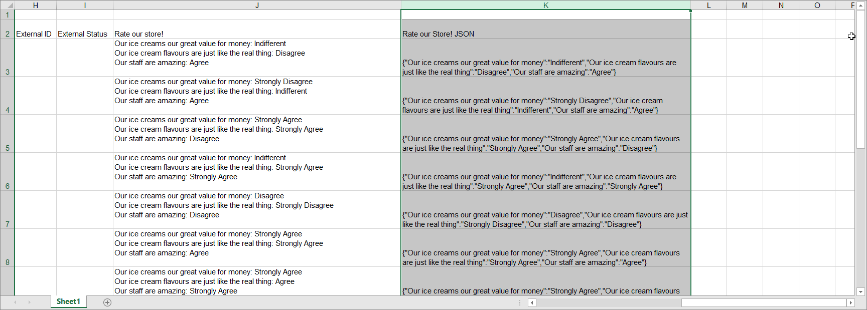
- When you open this file in Microsoft Excel, you’ll see that the responses to your checkbox field is represented in two columns. One comprises of comma separated values, while the other is in JSON format.
You can use Excel to transform this data into something it can graph.
- Select all of the data in the JSON column, including the header.
- In the Data tab in the Excel ribbon, select From Table/Range.
- In the Create Table dialog box, check My table has headers and select OK.
- This will open a Power Query Editor window. In the Transform tab of this window, select Parse > JSON.
This will parse your JSON data into a series of records.
-
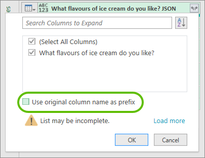
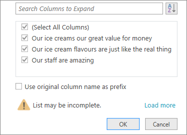
Select the expand button at the top of your parsed data.
-
In the window that opens, uncheck the
Use original column name as prefix box and select
OK.
This will expand your records into a series of lists.
-
Select the expand button at the top of your data again, and select
Expand to New Rows.
This will expand your lists into their component values.
This expanded data can be used to create a graph.
-
Once your data has been expanded as above in the
Power Query Editor, select the
Home tab in the
Editor ribbon, then
Close & Load > Close & Load To...
-
In the
Import Data dialog, select
PivotChart and
New worksheet, then select
OK.
-
To create your graph, or "pivot chart," drag your data into the Axis and Values boxes in the PivotChart Fields panel.
-
Congratulations, you've graphed the responses from a checkbox field.
You can right-click this chart in Excel and use the
Change Chart Type... option to select other chart types.
Graph a Radio Matrix Field
-
Create a form containing a Radio matrix field.
-
Publish the form.
-
When responses have come in, export your data to an Excel file.
- When you open this file in Microsoft Excel, you’ll see that the responses to your field is represented in two columns. One comprises of comma separated values, while the other is in JSON format.
You can use Excel to transform this data into something it can graph.
-
Select all of the data in JSON column, including the header.
-
In the
Data tab in the Excel ribbon, select
From Table/Range.
-
In the Create Table dialog box, check My table has headers and select OK.
-
This will open a
Power Query Editor window. In the
Transform tab of this window, select
Parse > JSON.
This will parse your JSON data into a series of records.
-
Select the expand button at the top of your parsed data.
-
In the window that opens, uncheck the Use original column name as prefix box and select OK.
This will expand your records into a series of lists.
-
Select all three of your lists by holding
Shift and selecting the headers.
-
In the
Power Query Editor ribbon's
Transform tab, select
Unpivot Columns.
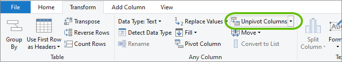
This will re-order your data into two columns corresponding to the questions and answers in your form's radio matrix field.
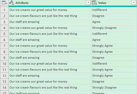
At this stage you may want to rename these columns "Question" and "Answer," or something similar, to make it easier to follow the next steps.
-
Once your data has been prepared as above in the
Power Query Editor, select the
Home tab in the
Editor ribbon, then
Close & Load > Close & Load To...
-
In the
Import Data dialog, select
PivotChart and
New worksheet, then select
OK.
-
To create your graph, or "pivot chart," go the the
PivotChart Fields panel, and drag your
Question data into the
Filter field, and your
Answer data into BOTH the
Axis and
Values fields.
-
You'll see that you've now created a graph of your radio matrix data.
-
To choose between the different questions in your graph, use the
Question drop-down menu.
-
You may also want to re-order your answer options.
-
You can right-click this graph in Excel and use the
Change Chart Type... option to select other chart types.
Graph a Checkbox Matrix
-
Create a form containing a Checkbox matrix field.
-
Publish the form.
-
When responses have come in, export your data to an Excel file.
- When you open this file in Microsoft Excel, you’ll see that the responses to your checkbox field is represented in two columns. One comprises of comma separated values, while the other is in JSON format.
You can use Excel to transform this data into something it can graph.
- Select all of the data in the JSON column, including the header.
- In the Data tab in the Excel ribbon, select From Table/Range.
- In the Create Table dialog box, check My table has headers and select OK.
- This will open a Power Query Editor window. In the Transform tab of this window, select Parse > JSON.
This will parse your JSON data into a series of records.
-
Select the expand button at the top of your parsed data.
-
In the window that opens, uncheck the
Use original column name as prefix box and select
OK.
This will expand your records into a series of lists.
-
Select all three of your lists by holding Shift and selecting the headers.
-
In the
Power Query Editor ribbon's
Transform tab, select
Unpivot Columns.
This will re-order your data into two columns corresponding to the questions and answers in your form's checkbox matrix field.
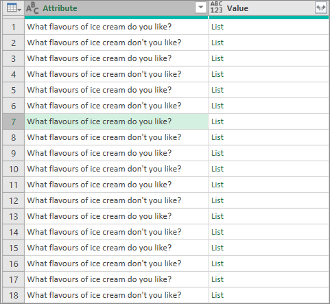
The second column will still consist of lists of answers, which need to be expanded.
-
Select the expand button at the top of the Value column, and choose Expand To New Rows.
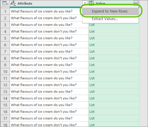
This will expand your lists into their component values.
At this stage you may want to rename these columns "Question" and "Answer," or something similar, to make it easier to follow the next steps.
-
Once your data has been prepared as above in the
Power Query Editor, select the
Home tab in the
Editor ribbon, then
Close & Load > Close & Load To...
-
In the
Import Data dialog, select
PivotChart and
New worksheet, then select
OK.
-
To create your graph, or "pivot chart," go the the
PivotChart Fields panel, and drag your
Question data into the
Filter field, and your
Answer data into BOTH the
Axis and
Values fields.
-
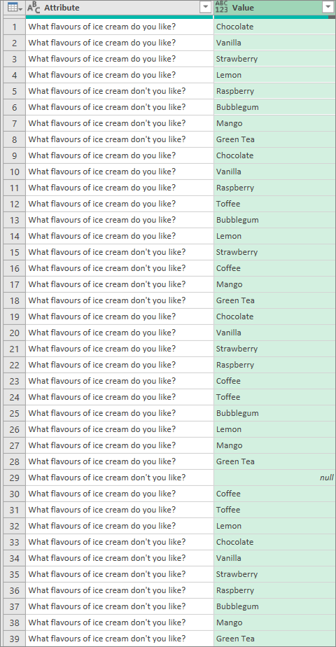
You'll see that you've now created a graph of your radio matrix data.
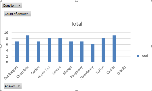
However, this initial chart includes all of your respondent answers, regardless of the questions asked.
In the example above, ice cream flavors that respondents
like and
don't like are tallied together - not ideal!
-
To display separate questions in your graph, use the Question drop-down menu to select a question to filter your results by.
-
You can right-click this graph in Excel and use the Change Chart Type... option to select other chart types.